5 Top Home Inspector Website Designs
Keen to avoid home-buying disasters? These 5 masterful inspection websites reveal what separates trustworthy pros from costly mistakes.


You might think a home inspector’s website is just pixels and code, but it’s actually a window into your future peace of mind. When you’re about to make the biggest purchase of your life, that nagging voice of uncertainty can keep you up at night. I’ve spent countless hours analyzing the web presence of home inspection companies, and what I’ve discovered about these five standout designs might surprise you – and save you from a potential real estate nightmare.
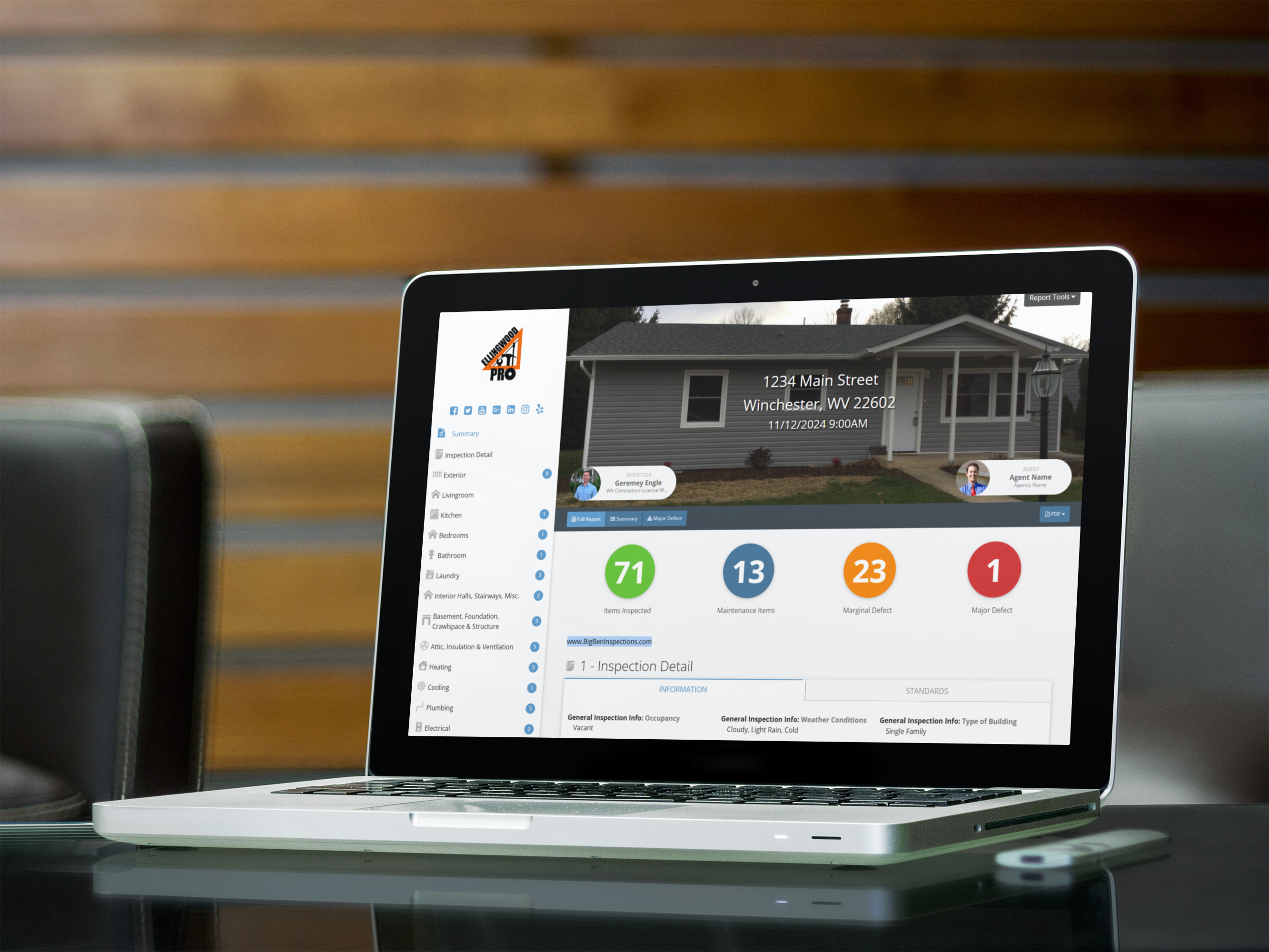
A pristine home inspection website can make the difference between landing that crucial client or watching them click away to your competitors. Ellingwood Pro nails this challenge with their sleek, approachable design that’ll put your anxious house-hunting clients at ease.
Your inspection website is your digital business card – make it shine or watch potential clients slip through your fingers.
You’ll notice their user friendly navigation immediately – it’s like having a skilled inspector guide you through each room of a well-maintained home. The engaging color scheme, featuring calming blues and crisp whites, creates an atmosphere of professional reliability that’ll help dissolve those nagging doubts about choosing the right inspector.
When you’re investing hundreds of thousands in a property, you can’t afford to trust your inspection to someone with a clunky, outdated website.
Elite’s modern design whispers “competence” while their streamlined layout screams “we’ve got this covered.”
When you’re competing against dozens of other inspection companies, stunning photography can transform your website from forgettable to unforgettable. Northwest Property Inspectors masters visual storytelling through carefully curated images that speak directly to your deepest homebuying anxieties. You’ll see exactly what you’re getting before booking an inspection.
| Features | Benefits | Impact |
|---|---|---|
| 4K Photos | Crystal Clear | Trust Building |
| Drone Shots | Full Coverage | Confidence |
| Virtual Tours | Convenience | Transparency |
Their client engagement strategy relies heavily on showing rather than telling. You’ll find yourself drawn into immersive property stories through detailed inspection photos that reveal hidden issues you’d never spot yourself. Every crack, leak, and structural concern is documented with surgical precision, giving you that much-needed peace of mind. It’s like having a trusted friend walk you through each property’s potential pitfalls.

Building trust in home inspection requires more than just technical expertise, which is why Precision Home Analysis showcases their impressive credentials front and center.
You’ll notice their certification badges prominently displayed, each one representing countless hours of specialized training and real-world experience.
What’ll really catch your eye are the customer testimonials – they’re not just generic praise, but detailed accounts of how their thorough inspections saved buyers from costly mistakes.
You’ve probably heard horror stories about missed foundation issues or hidden water damage, but that’s where their credentials make all the difference.
Their inspectors have undergone rigorous state licensing, continuing education, and specialized training in areas like mold detection and structural analysis.
When you’re making one of life’s biggest investments, you’ll want this level of expertise on your side.
Since today’s home buyers largely search on their phones, Landmark Inspection Group’s mobile-first website delivers a seamless experience that’ll make you feel like you’re holding their entire business in your palm.
Access everything Landmark Inspection Group offers through their sleek mobile site – like having a home inspector in your pocket.
Their responsive design effortlessly adapts to any screen size, eliminating that frustrating pinch-and-zoom dance we’ve all done on poorly optimized sites.
You’ll love how the site’s intuitive layout guides you through each step, keeping anxiety at bay while you navigate this vital part of home buying.

Their effective messaging speaks directly to your deepest concerns about home buying.
The moment you land on their homepage, you’re guided through a seamless user experience that understands exactly what you’re feeling.
That bright, pulsing “Book Now” button sits right where your eyes naturally fall, offering immediate relief from the stress of house hunting.
It’s like they’re reaching through the screen, taking your hand, and saying “We’ve got this.”
You’ve seen how these top home inspector websites masterfully blend form and function. They’re not just pretty interfaces – they’re anxiety-reducing tools that transform the intimidating home inspection process into something manageable. Whether it’s Elite’s calming aesthetics or Heritage’s crystal-clear guidance, each site proves that thoughtful design directly impacts client confidence. When you’re battling inspection jitters, these websites become your digital compass, steering you toward peace of mind.
As someone who spends a ridiculous amount of time analyzing letterforms (my partner has caught me photographing store signage more times than I care to admit), I’m fascinated by how different industries approach typography. Today, I’m turning my obsessive eye toward home improvement companies, where typography often needs to balance professionalism with approachability, technical expertise with customer-friendly warmth.
Let’s examine five companies that have made interesting typographic choices in an industry not typically celebrated for design innovation.
When examining local service providers like BPM Heating & Cooling, which services HVAC in Frederick MD, I’m often pleasantly surprised by thoughtful typography that defies the “slap a generic sans-serif on it” approach.
BPM uses a modified version of Proxima Nova for their logo, with custom spacing that creates a distinctly professional yet approachable feel. For their website and printed materials, they’ve paired this with Merriweather for body text – an excellent choice that provides readability at smaller sizes while maintaining the technical authority necessary for an HVAC company.
What’s remarkable is how this typographic system works across contexts: from vehicle wraps to technical documentation to digital interfaces. The slight weight contrast between “BPM” and “Heating & Cooling” in their lockup creates a visual hierarchy that guides the eye while emphasizing their full-service capabilities.
It’s a masterclass in how regional service providers can use typography to elevate their brand beyond the expected.
Lowe’s 2021 typographic refresh deserves attention for how it maintained brand recognition while creating a more cohesive system. Their shift to a custom typeface (“Lowe’s Sans”) created specifically for their diverse communication needs shows a sophisticated understanding of typography’s role in retail.
What impresses me most is how this custom font family handles the transition between in-store signage (where it needs to work at large scale with significant viewing distances) and digital platforms (where legibility on mobile devices is crucial). The typeface features slightly condensed proportions that maximize space efficiency in product catalogs without sacrificing readability.
The slightly increased x-height compared to their previous system also improves accessibility – a thoughtful consideration for a brand serving both professionals and DIYers across age demographics.
For a company whose product is color, Sherwin-Williams demonstrates remarkable restraint in their typography. Their primary typeface, a modified Helvetica Neue, provides a neutral vessel that allows their color offerings to take center stage.
What’s interesting is how they use weight variations to create distinct personalities across their various product lines. Their premium “Emerald” collection uses Helvetica Neue Light with increased letter-spacing, creating an airy, sophisticated feel, while their contractor-focused “ProMar” series uses Helvetica Neue Bold with tighter spacing, signaling durability and efficiency.
This systematic approach proves that even with a seemingly “safe” typeface choice, thoughtful application can create rich brand expressions.
The Home Depot’s typographic system is fascinating because it embraces the vernacular quality of their original hand-drawn logo and extends that character throughout their communication.
Their primary typeface (a customized version of Impact) maintains the bold, slightly compressed quality of their iconic wordmark while offering more flexibility. What’s notable is how they don’t fight against the “working-class” associations of their typography but rather embrace it as part of their authentic brand voice.
Their secondary typeface for body copy (a humanist sans-serif) creates an interesting tension with the more industrial headline font, much like how their stores balance professional-grade tools with consumer-friendly shopping experiences.
On the opposite end of the spectrum, Restoration Hardware (now RH) uses typography as a primary vehicle to signal their transition from a mid-market retailer to a luxury design brand.
Their shift to a custom serif typeface with distinct classical proportions and high contrast between thick and thin strokes immediately positions them adjacent to luxury fashion brands rather than traditional home improvement retailers.
The generous white space surrounding their typography, along with refined letter-spacing in all-caps settings, creates a sense of exclusivity and restraint that justifies their premium pricing. Their typographic system demonstrates how letterforms can reposition an entire brand within a competitive landscape.
What fascinates me about these examples is how typography helps these brands navigate complex identity challenges. Home improvement companies must simultaneously project technical competence, creativity, approachability, and trustworthiness—attributes that might seem contradictory.
Smart typographic systems, like the ones highlighted above, resolve these tensions through thoughtful selection and application. Whether it’s a regional provider like BPM Heating & Cooling finding distinction in a crowded HVAC market or a national retailer like Lowe’s creating coherence across thousands of touchpoints, typography is doing important brand work.
Next time you’re driving through Frederick, MD, or wandering the aisles of your local home improvement store, take a moment to consider how the letterforms you see are shaping your perception of these brands. Typography is never neutral—it’s always telling a story about who a company is and who they believe their customers to be.
What home improvement brands do you think have particularly effective typography? Share your examples in the comments below!
When you first watch the opening sequence of "Stranger Things," you'll notice how those glowing red letters pulse and slide across the screen, drawing you deeper into its eerie world. That's kinetic typography at work – text that moves with purpose and personality. You've probably seen it everywhere from movie titles to lyric videos, but you might not realize the intricate dance of motion, timing, and emotion happening behind those animated letters. There's a whole technical and artistic universe waiting to reveal itself.

When you first plunge into kinetic typography, there's something almost magical about watching letters dance and transform across the screen. Your heart races as you realize you're not just dealing with static text anymore – you're orchestrating a visual performance where each letter plays its part in telling your story.
The secret lies in understanding typographic hierarchy, which lets you control where your viewer's eyes should go first, second, and last.
Mastering typographic hierarchy is like being a visual conductor, guiding your audience's gaze through a carefully choreographed journey.
You'll find yourself obsessing over visual rhythm, watching the way each movement flows into the next. It's like conducting a symphony, but instead of musical notes, you're directing letters through space and time.
Trust me, once you grasp these core principles, you'll never look at moving text the same way again.
Before diving into kinetic typography, you'll need to arm yourself with the right digital weapons in your creative arsenal. Trust me, I've felt that overwhelming panic when facing the vast ocean of animation software options out there.
The essentials? Start with After Effects – it's the industry standard for motion graphics and won't let you down. You'll also want reliable text editors and typography plugins that won't crash when you're burning the midnight oil.
For those heart-racing moments when deadlines loom, having video editors like Premiere Pro at your fingertips can be a lifesaver.
Design tools like Illustrator seamlessly integrate with your workflow, letting you craft those perfectly curved letters that'll make your typography dance. Remember, these aren't just programs – they're your faithful companions in the digital trenches.

Mastering motion design techniques feels like learning to juggle while riding a unicycle – there's a lot to keep track of, but once you get it, it's pure magic.
You'll need to harness kinetic energy through strategic keyframes, timing your text's movements to create visual rhythm that captivates your viewer's attention.
Start with basic transitions – fade-ins, scale changes, and position shifts. Then, layer in more complex effects like motion blur, rotation, and parallax scrolling.
Master the fundamentals before diving into advanced effects – your motion design skills will grow naturally from a solid foundation.
You'll find yourself obsessing over milliseconds and easing curves, tweaking each movement until it flows just right. The secret lies in making your text dance without making your viewer dizzy.
Although kinetic typography can dazzle viewers with flashy movements, you'll need to master fundamental design principles to create truly effective motion text. Trust me, I've learned through painful trial and error that font selection and color theory aren't just fancy terms – they're your lifeline when crafting engaging animations.
| Principle | Do's | Don'ts | Impact |
|---|---|---|---|
| Timing | Flow naturally | Rush movements | Readability |
| Spacing | Create rhythm | Overcrowd | Harmony |
| Contrast | Guide attention | Compete visually | Focus |
| Scale | Build hierarchy | Overwhelm | Balance |
You've got to feel the rhythm of each movement, like a dance between letters and space. When your heart starts racing from uncertainty, remember that simplicity trumps complexity. Let each character breathe, and don't let your fear of empty space force you into cluttered compositions.

The raw emotional power of moving text can shake viewers to their core – I've seen grown adults gasp when letters cascade like teardrops down a screen.
You'll find that when words pulse with the rhythm of a heartbeat or shatter like broken glass, they create an emotional resonance that static text simply can't match.
In visual storytelling, you're not just reading words – you're experiencing them.
Watch how dancing letters can whisper secrets, or how bold text can punch through the darkness with explosive force.
When you time the movement just right, each word becomes a character in its own drama.
You'll feel your pulse quicken as letters race across the screen, or your breath slow as they drift like autumn leaves, telling stories that pierce straight through to your soul.
You've initiated a journey through typography's most dynamic frontier, where letters dance like fireflies in the night. As you experiment with motion and timing, you'll discover how kinetic type transforms mundane messages into visual poetry. Remember, your animated text isn't just moving – it's breathing life into stories, capturing emotions, and leading viewers through a carefully choreographed performance that'll leave lasting impressions long after the final frame fades.
You've probably stared at text until your eyes turned to mush, wondering why it feels so cramped and uncomfortable. That's where leading comes in – the precious breathing room between lines that can make or break your typography. As a designer who once botched an entire magazine layout by getting the leading wrong, I can tell you there's a special kind of dread that comes with realizing your text is practically suffocating on the page. Let's fix that before your next project becomes a cautionary tale.

Space – the invisible breathing room between lines of text – is what typography leading is all about.
You'll find yourself squinting at cramped text when it's too tight, or losing your place when it's too loose. The leading definition is simple: it's the vertical distance between lines of text, measured from baseline to baseline.
Here's why the leading impact matters so much: your brain needs that perfect balance of whitespace to process information smoothly.
I've spent countless hours staring at screens, feeling my anxiety build as I struggled with poorly spaced text.
Think of leading like taking a deep breath between sentences – too shallow, and you're gasping; too deep, and you're dizzy.
When you get it right, though, the words flow effortlessly, and your readers won't even notice why they're so comfortable.
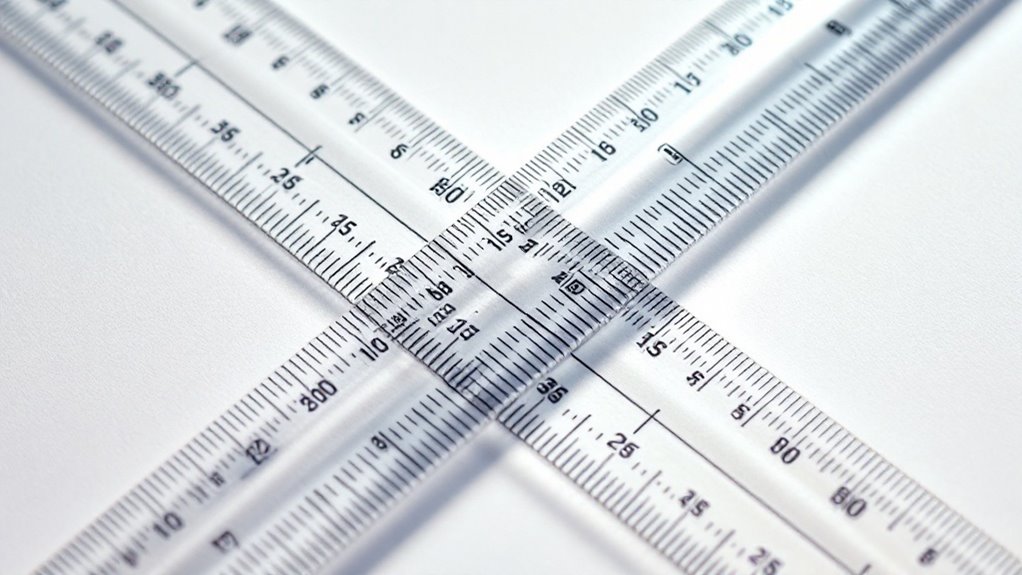
Numbers strike fear into many designers' hearts when measuring leading, but you'll soon discover it's simpler than you think. Just grab your ruler or digital tools – I know your hands might be trembling a bit – and let's tackle these leading measurement techniques together.
Think of leading like the breathing space between lines of text. When you're measuring, you'll start from one baseline to the next, just as if you're climbing stairs. It's that delicate space that impacts readability in ways you mightn't expect.
Trust me, I've watched countless designers agonize over whether 14-point or 16-point leading would work better, their faces scrunched in concentration. But here's your secret weapon: start with leading that's 120% of your font size. You'll feel those anxiety knots loosening already.

Even armed with perfect measurements, designers still stumble into leading pitfalls that can turn beautiful typography into a jumbled mess.
Mastering measurements isn't enough – even skilled designers can fall victim to leading mistakes that destroy typographic harmony.
I've seen countless leading errors that make me cringe, and I want to help you avoid those same heart-stopping moments when you realize your spacing issues have derailed your entire design.
Here are the three most devastating mistakes you'll want to dodge:
Trust me, these mistakes can transform your carefully crafted typography into a designer's nightmare faster than you can say "line spacing."
While print and digital typography might seem like close cousins, they'll betray you with their subtle differences if you're not paying attention. Trust me, I've learned this the hard way – watching beautiful print layouts crumble into digital chaos.
For print readability, you'll want to keep your leading tighter, around 120% of your font size. Those pristine pages deserve that snug, sophisticated feel.
But digital? That's where your anxiety might spike. Digital spacing demands more room to breathe – about 150% of your font size. I've seen perfectly legible print layouts turn into eye-straining nightmares on screen.
You're fighting against backlit displays and varying screen resolutions, so don't be afraid to give those lines some extra space. Your readers' eyes will thank you.
Getting your leading just right can feel overwhelming without the proper tools in your arsenal.
Mastering leading requires the right typographic toolkit – without it, you're navigating design's trickiest waters blindfolded.
I've spent countless hours fiddling with spacing until my eyes burned, but I've learned that having the right leading tools makes all the difference in creating beautiful typography.
Here are my favorite leading techniques that'll help you nail perfect spacing every time:
Once you've set your leading values, testing them in real-world conditions becomes a nerve-wracking but essential step that'll make or break your typography. Your palms might get sweaty as you adjust that line spacing, wondering if you've made the right choice.
Trust me, I've been there – staring at the screen until my eyes blur, second-guessing every decision.
Here's what you'll need to do: Print your text at actual size, then step back. Does your heart race when you notice text legibility issues you didn't see before? That's normal.
Move closer, then farther away. Check it under different lighting conditions. Your gut will tell you when the spacing feels right. If something seems off, don't panic – just make small adjustments until it clicks.
You've now mastered the essentials of typography leading, from pixel-perfect measurements to expert applications across print and digital. As you refine your designs, you'll discover how those tiny adjustments in spacing can transform cluttered text into crystal-clear communication. Remember, whether you're working with magazines or mobile screens, leading isn't just about numbers – it's about creating breathing room that lets your message shine through effortlessly.
You've probably felt that gnawing uncertainty when staring at your typography choices, wondering if they'll make or break your design. I'll never forget the crushing feedback I received on my first major project – the leading was so tight it made the text practically unreadable. After years of mistakes and refinements, I've distilled the art of typography spacing into five critical steps that'll transform your approach. Let's explore how you can avoid the common pitfalls that plague even seasoned designers.

Three fundamental aspects of leading – the space between lines of text – can make or break your design's readability.
You'll want to master default leading, which keeps text comfortably spaced at 120% of your font size. I've learned the hard way that tight leading can feel suffocating, while loose spacing makes your eyes wander nervously between lines.
When you're working with font pairing, you'll notice how different typefaces demand unique line spacing approaches.
Trust me, there's nothing worse than realizing your carefully chosen fonts are fighting each other because of poor leading choices.
Poor leading can turn the perfect font pairing into visual chaos, destroying the harmony you worked so hard to create.
You've got to feel the rhythm of your text – too cramped, and it's like trying to breathe in a crowded elevator; too loose, and your words float away like scattered leaves.
Successful leading begins with a thorough exploration into your content's personality and purpose. You'll need to deeply understand your content tone and how it resonates with your audience's emotional state. Trust me, I've seen beautiful layouts fall apart because they didn't match the contextual relevance of their message.
| Content Type | Ideal Leading | Emotional Impact |
|---|---|---|
| Headlines | 90-120% of type | Bold, commanding |
| Body Text | 120-150% of type | Easy, flowing |
| Footnotes | 140-160% of type | Light, airy |
When you're examining your content, pay attention to how it makes you feel. Does it need to whisper softly with generous spacing, or should it command attention with tighter leading? Your typography should mirror your message's soul – whether it's a gentle bedtime story or an urgent call to action.

Every designer faces that heart-pounding moment when they must choose their base leading value – it's like standing at the edge of a typographic cliff.
Setting your first leading value feels like peering into a creative abyss, where one misstep could derail your entire design.
You'll feel your palms sweat as you hover over that base font, knowing that one wrong leading adjustment could send your entire design tumbling into chaos.
Don't let that anxiety paralyze you. Start with the tried-and-true rule of setting your leading at 120% of your base font size – it's your safety harness in this challenging climb.
For a 16px font, you'd begin with 19.2px leading.
But here's the secret I've learned through countless sleepless nights: let your content breathe.
Watch how your text flows across the screen, and trust your gut when it whispers that something needs tweaking.
Once you've settled on what looks perfect on your desktop screen, reality hits hard – that pristine typography might turn into an unreadable mess on other devices.
You'll need to test your font sizes and line spacing across different screens to avoid that sinking feeling when your carefully crafted text becomes a jumbled nightmare.
Here's what you'll want to check:
Don't just trust your gut – get real feedback from users struggling with your typography choices.
Their squinting faces won't lie.

When you're staring at your typographic mess, finding the right visual hierarchy feels like untangling a ball of knotted yarn – frustrating yet necessary.
You've probably spent hours tweaking your leading adjustments, only to feel your stomach sink as the text still looks off somehow.
Here's the truth: mastering visual flow isn't just about following rigid rules. It's about trusting your gut while you adjust the spacing between those stubborn headline levels.
Start with your main heading – make it breathe with generous leading. Then, progressively tighten the leading as you work down through subheadings and body text.
You'll feel your anxiety melt away as the pieces start falling into place, creating a natural rhythm that guides your reader's eyes exactly where you want them to go.
Like a conductor fine-tuning an orchestra, you've now mastered the art of typography leading. You'll find yourself instinctively adjusting those subtle spaces between lines, creating harmony that draws readers into your content. As you apply these five steps, you're not just designing text – you're crafting experiences. Remember, perfect leading isn't about following rigid rules; it's about finding that sweet spot where readability meets visual appeal.