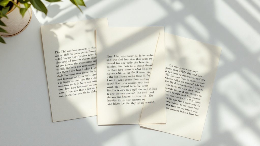
You've probably stared at text until your eyes turned to mush, wondering why it feels so cramped and uncomfortable. That's where leading comes in – the precious breathing room between lines that can make or break your typography. As a designer who once botched an entire magazine layout by getting the leading wrong, I can tell you there's a special kind of dread that comes with realizing your text is practically suffocating on the page. Let's fix that before your next project becomes a cautionary tale.
What Is Leading and Why Does It Matter

Space – the invisible breathing room between lines of text – is what typography leading is all about.
You'll find yourself squinting at cramped text when it's too tight, or losing your place when it's too loose. The leading definition is simple: it's the vertical distance between lines of text, measured from baseline to baseline.
Here's why the leading impact matters so much: your brain needs that perfect balance of whitespace to process information smoothly.
I've spent countless hours staring at screens, feeling my anxiety build as I struggled with poorly spaced text.
Think of leading like taking a deep breath between sentences – too shallow, and you're gasping; too deep, and you're dizzy.
When you get it right, though, the words flow effortlessly, and your readers won't even notice why they're so comfortable.
The Basics of Measuring Leading
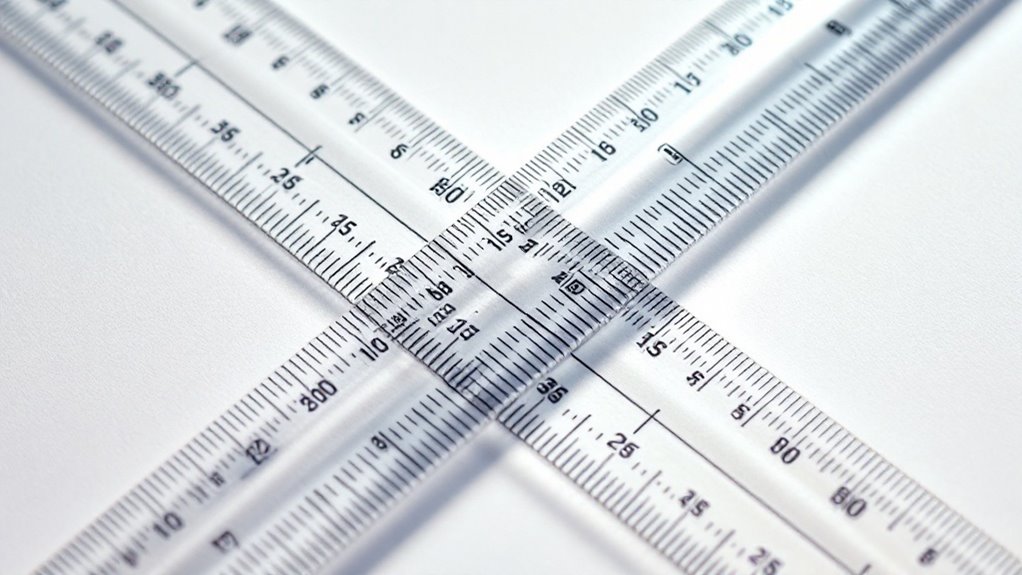
Numbers strike fear into many designers' hearts when measuring leading, but you'll soon discover it's simpler than you think. Just grab your ruler or digital tools – I know your hands might be trembling a bit – and let's tackle these leading measurement techniques together.
Think of leading like the breathing space between lines of text. When you're measuring, you'll start from one baseline to the next, just as if you're climbing stairs. It's that delicate space that impacts readability in ways you mightn't expect.
Trust me, I've watched countless designers agonize over whether 14-point or 16-point leading would work better, their faces scrunched in concentration. But here's your secret weapon: start with leading that's 120% of your font size. You'll feel those anxiety knots loosening already.
Common Leading Mistakes to Avoid

Even armed with perfect measurements, designers still stumble into leading pitfalls that can turn beautiful typography into a jumbled mess.
Mastering measurements isn't enough – even skilled designers can fall victim to leading mistakes that destroy typographic harmony.
I've seen countless leading errors that make me cringe, and I want to help you avoid those same heart-stopping moments when you realize your spacing issues have derailed your entire design.
Here are the three most devastating mistakes you'll want to dodge:
- Setting your leading too tight, which creates an anxiety-inducing wall of text that suffocates your readers.
- Using inconsistent leading across different sections, making your layout feel disjointed and unprofessional.
- Forgetting to adjust leading for different font sizes, leaving you with awkward gaps that'll haunt your design.
Trust me, these mistakes can transform your carefully crafted typography into a designer's nightmare faster than you can say "line spacing."
Best Practices for Print Vs Digital Leading
While print and digital typography might seem like close cousins, they'll betray you with their subtle differences if you're not paying attention. Trust me, I've learned this the hard way – watching beautiful print layouts crumble into digital chaos.
For print readability, you'll want to keep your leading tighter, around 120% of your font size. Those pristine pages deserve that snug, sophisticated feel.
But digital? That's where your anxiety might spike. Digital spacing demands more room to breathe – about 150% of your font size. I've seen perfectly legible print layouts turn into eye-straining nightmares on screen.
You're fighting against backlit displays and varying screen resolutions, so don't be afraid to give those lines some extra space. Your readers' eyes will thank you.
Tools and Techniques for Perfect Leading

Getting your leading just right can feel overwhelming without the proper tools in your arsenal.
Mastering leading requires the right typographic toolkit – without it, you're navigating design's trickiest waters blindfolded.
I've spent countless hours fiddling with spacing until my eyes burned, but I've learned that having the right leading tools makes all the difference in creating beautiful typography.
Here are my favorite leading techniques that'll help you nail perfect spacing every time:
- Use your design software's built-in leading shortcuts (Command/Ctrl + Alt + Up/Down) for quick adjustments
- Create a baseline grid and stick to it religiously – it's your typographic north star
- Leverage the "Preview" mode to check your leading in real-world conditions
Testing and Adjusting Leading for Readability
Once you've set your leading values, testing them in real-world conditions becomes a nerve-wracking but essential step that'll make or break your typography. Your palms might get sweaty as you adjust that line spacing, wondering if you've made the right choice.
Trust me, I've been there – staring at the screen until my eyes blur, second-guessing every decision.
Here's what you'll need to do: Print your text at actual size, then step back. Does your heart race when you notice text legibility issues you didn't see before? That's normal.
Move closer, then farther away. Check it under different lighting conditions. Your gut will tell you when the spacing feels right. If something seems off, don't panic – just make small adjustments until it clicks.
Conclusion
You've now mastered the essentials of typography leading, from pixel-perfect measurements to expert applications across print and digital. As you refine your designs, you'll discover how those tiny adjustments in spacing can transform cluttered text into crystal-clear communication. Remember, whether you're working with magazines or mobile screens, leading isn't just about numbers – it's about creating breathing room that lets your message shine through effortlessly.

